March 3, 2013
Oh, ok, so I just wait 75 days and then I can watch the movie I bought? Sounds great! WTF, #apple @iTunes ???!!! FAIL.
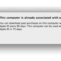
Oh, ok, so I just wait 75 days and then I can watch the movie I bought? Sounds great!
No idea why all of a sudden this started happening (I didn’t “associate” the computer with a different Apple ID), but apparently this has been a known issue for years, since June 2011.
Google search: http://bit.ly/12m325F
I guess the intent was to prevent piracy ( http://betanews.com/2011/06/07/what-happens-when-you-download-itunes-past-purchases-with-a-different-account/ ) but both in concept and implementation this is a horrific user experience fail. Beyond embarrassing.
Simple solution instead of this malarkey: if you try to play or download something that was purchased with a different Apple ID, you are asked to enter the user name / password for the Apple ID used to purchase the item.
I also just learned this:
“Movies rented on your Apple TV are not transferable to any other device and can only be viewed on your Apple TV.” ( http://support.apple.com/kb/HT1498 )
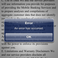
Fucked up. I love my Apple TV but honestly this is so absurd that I might ditch it and find an alternative…
It’s funny, I just read this article yesterday:
Maybe I’ve been cursed with the Zeldman Curse?!… NOOOOO!!!…