Some simple usability fixes for Mac OS X Lion / Mountain Lion
I hate the all gray icons in Lion, they make it harder to find what you’re looking for. (Wrote about this here a while back….)
Turns out there is an app for that — download “SideEffects” and restore some basic usability to the Finder:
https://www.macupdate.com/app/mac/43078/sideeffects
![]()
(Unfortunately this appears to only work in the Finder itself. Sidebar icons in open/save dialogs, for example, are still the undifferentiated gray:
![]()
Boo.
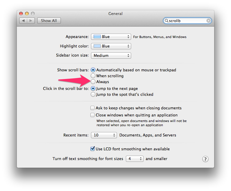
One of the other things that has always annoyed me is the scrollbars. I don’t like the fact that they hide. What is the purpose of this, to save 15px of screen real estate? At the expense of the user not knowing at glance that the content they are viewing is scrollable, or how much more content there is offscreen? Dumb. Just show me the damb scrollbar, Apple.
Turns out this is a simple fix, just change the setting in System Preferences. *slaps forehead*