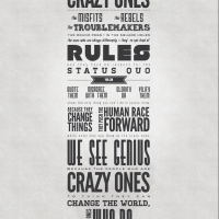
design


Still think #Apple messed up by removing all color from their icons in Lion. Elegant maybe but less usable.
Been using Lion for a couple weeks now and still can’t get used to this. It always takes the eye/brain longer to find the thing you’re looking for.
Also the choice of gray is bad — it feels like they’re all disabled or something…
Finder:
![]()
iTunes:
![]()
Color is hugely important. This should be common sense. Imagine if all of the icons in your Dock…

…were black and white. How much harder would it be to identify them quickly?

“Bizarre ER” – cool little intro animation
Clever: The B-Line – A Special Phone for Special Clients

Design decisions at Apple vs Google – The Auteur vs. the Committee
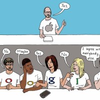
One person is the Decider for final design choices. Not focus groups. Not data crunchers. Not committee consensus-builders. The decisions reflect the sensibility of just one person: Steven P. Jobs, the C.E.O.
By contrast, Google has followed the conventional approach, with lots of people playing a role. That group prefers to rely on experimental data, not designers, to guide its decisions.
The contest is not even close. The company that has a single arbiter of taste has been producing superior products, showing that you don’t need multiple teams and dozens or hundreds or thousands of voices.
http://www.nytimes.com/2011/07/24/technology/what-apple-has-that-google-doesnt-an-auteur.html
Design Is Not The Goal / FINCH
“Form Informs Function” – great read – sometimes easy to forget that “Design Is Not The Goal.”