Evolution of Google.com 1997-2011
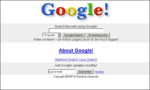
In 1997 to early 1998, Google was still available at google.stanford.edu. The Beta sign wasn’t yet live.
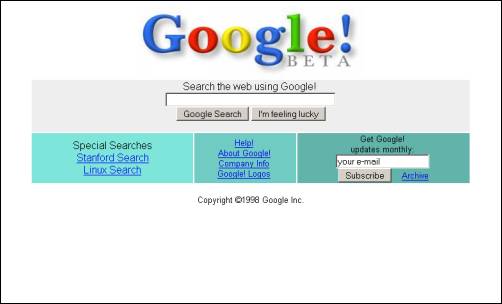
In 1998, Google was almost cluttered. Back then there was still some emphasis on “Stanford Search,” showing the roots of where Google comes from. Also, right on the front-page you could subscribe to thenow extinctGoogle Friends newsletter. And of course, Google – with the not so pretty logo co-founder Sergey made in GIMP – was still in Beta…
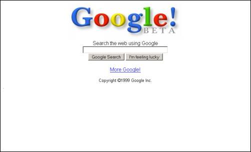
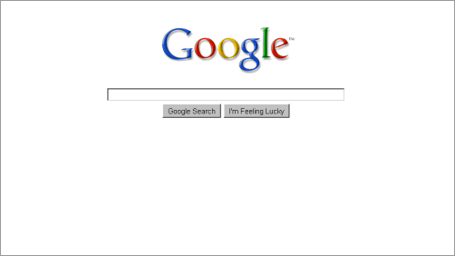
In 1999, you can see Google realizes its search engine can stand on its own, and focuses on something the competitors at that time were slowly losing: total focus on search, with a completely uncluttered homepage. Google.com would never again have as little links as in 1999. The logo at that time is still a bit ugly… and Google still feels the need to explain what it does (“search the web using Google”).
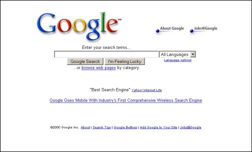
In 2000, after having survived the Y2K bug (and about to be surviving the dotcom crash), Google localizes with a language box, and also offers jobs and an About page highlighted with blue bullets. In 2000, Google – out of Beta now – was proud to be named “Best Search Engine” by Yahoo Internet Life. Google is also pushing its WAP services on the front-page. On a side-note, I can see “SM” instead of “TM” next to the logo… Disclaimer: I don’t know if this Archive.org depiction of Google.com, with the non-centered logo, is completely accurate.
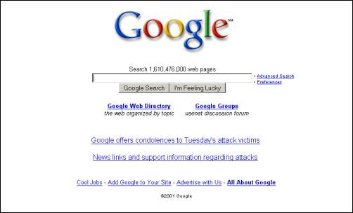
In 2001, some days after the 9/11 attacks on the World Trade Center, Google offers condolences to the attack victims. Along with the Madrid bombings years later, this would be about the only time Google shows news and support links on the front-page.
Also that year, Google pushes further services – Google’s now mostly discontinued Google Web Directory (which was based on the DMOZ.org Open Directory), and Google Groups (an archive acquired from Deja News). Above the search box, Google now shows you how many pages they search through (another feature that didn’t survive). Now if I had to put a date on it, I’d say 2001 was the year when truly every internet surfer (and their mom) would start to get to know about Google, but of course its growth was steady ever since it began. Disclaimer: I photoshopped this image because the logo wasn’t showing on Archive.org – I used the previous year’s logo.
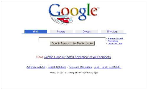
In 2002, Google changes its mind about where to put additional links (which grow in number), and introduces blue tabs on top of the search box. The index size is now advertised in the footer position, and the three links to the right side of the search box are what we’re having today (advances search, preferences and language tools). Also in 2002, one of the first (the first?) weblog on Google started, and it soon became highly popular.
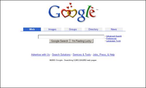
On this screen from 2004, Google celebrates Valentine’s Day. Not much else is new on the homepage, but the index size increased a whalopping 1 billion pages (not a huge increase by today’s standards perhaps, but those were different times only three years ago).
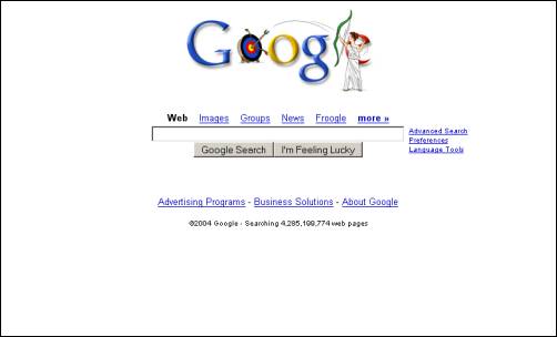
In 2004 (here showing with an Olympics logo), Google got rid of its tabs on top of the search box, making the page simpler again, while taking their company public. They now had a list of links (Web, Images, Groups, News, Froogle – no more Directory), as well as a “more” link to get to Google’s list of services. This approach scales a little better, but still only the most popular Google services (by the traffic they get, from what we know) will ever make it on the select few homepage links.
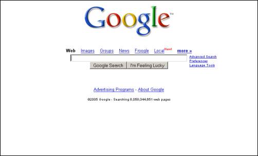
In 2005, Google’s index size almost doubled from last year. Google introduces Google Local to the front-page and gets rid of its “Business Solutions” link at the bottom.
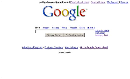
In 2006 (the year Google somewhat lost their innocence due to search censorship cooperation with the Chinese government), chances are high you’re logged into one of the many Google services with your Google Account. That means you’ll also be seeing the somewhat awkwardly positioned personalized links pane in the top right. Other than that, the “Business Solutions” link returned, and there’s no more index size indicator in Google’s footer. Still, search for two wildcard characters and you might see something in the range of 25 billion indexed pages… we’ve come along way.
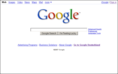
In 2007, a decade after its inception, the Google homepage undergoes a dramatical change (at least in relation to the minimalism of its layout): the navigation moves from above the search box to the top-left of the page, a move mirrored on other Google pages – like Google Image Search, or Google News search. The context navigation links now adjust to where you are, meaning they’re context-sensitive but also inconsistent (a potential issue from the point of view of usability). Now, Google’s motto is to have a “universal search,” integrating its different sub-search types (images, blogs, etc.) into a single experience. When you search for elvis presley, for instance, the search types web, music, video and images will be suggested, but when you search for iraq, the suggestions will be to further research in news, blogs, video, maps and images.
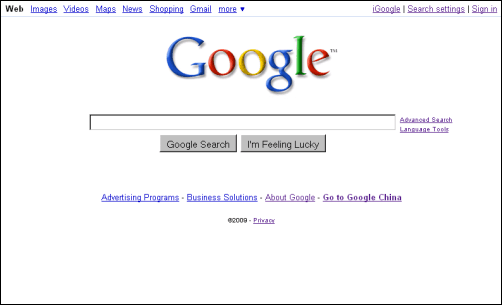
In 2009, the Google search box and buttons got bigger, and there’s more spacing in-between the buttons. Auto-completion of search queries has already been running for quite some time. The search settings link is now found on top, not at the side of the search box. The privacy link is at the bottom.
In late 2009, Google rolls out one of their biggest changes so far: a clutter-free homepage showing only the logo, search box and two search buttons. All the other links only fade in after you move your mouse. After testing several prototype variants of this design to random users, this is the one Google decided performs even better for people in the long run, once they got used to it. Google.com is now even more minimalist.
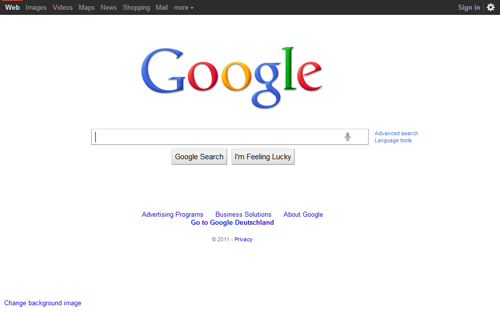
In June 2011, Google turns their top navigation bar dark (the bar had been reintroduced a while ago after the ultra-minimalist, fade-in from white design had ended). If viewing the page in Google’s Chrome browser, you’ll also spot a microphone icon which, when clicked, allows you to speak your search keywords. These days, entering something into the box will immediately move the box upwards and show results below… without a full page reload, and without you having to hit the return key. Signed in to Google’s new Google+, the page looks a bit different.
Pretty fascinating. Nice to see the progression to simpler & cleaner…
